Nicholas Tierney | The Future of Missing Data | Posit (2022)
videoimage: thumbnail.jpg
Transcript#
This transcript was generated automatically and may contain errors.
My name is Nick Tierney and I'm here to talk about the future of missing data.
So I fully hate missing data. It disrupts your data analysis because you need to stop and work out how much is missing and think, why is it missing? Why?
Missing data controls messages. I mean, imagine if what I said just then was bleeped out. You might get a different idea of what I was saying.
I redacted hate and missing data. It redacted your data analysis because redacted and work out how redacted is missing and think, why redacted and redacted and redacted? Why?
But the truth is I actually love missing data in a funny way. Understanding it's hard, but it has an extra challenge, a little bit of spice to a data analysis. And it's been something that I've found really exciting and curious about a data analysis project.
I've actually written two R packages to help explore your data and explore missing data. And today I'm going to talk about two things, a principle of going from overview to relationship to explore your missing data and a brief tour of missing data visualizations. Emphasis on the brief, I won't have time to explore them all in detail.
Overview: viz miss
So the first one I'd recommend is an overview, viz miss. This gives you a bird's eye view of your missing data. Here the rows are your observations and the columns are your variables. If we look at the data here, we see that the black spots here are missing and the gray are present. And what we take away from this is that air temperature C is missing and humidity is also missing. They have two big chunks of missing data. There's also a few times where there's these black streaks and that indicates that some variables go missing together.
We also know that there is extra information on the amount of missing in each variables. Here's 11% missing in air temperature and 12% missing in humidity.
Exploring relationships with geom_misspoint
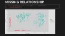
So now we go from the overview here and we take these two variables that are interesting to us, that have a lot of missing, and we plot them together to explore a relationship. We can do this with ggplot, with air temperature on the x-axis and humidity on the y-axis, but we get a little interesting problem here, which says that it's removed 171 rows containing missing values. So how do you show these values that are removed, how do you show missing values if they're missing? You can use geom.misspoint. This is a regular ggplot geom and this will impute the values of the data to be lower than the range of the data, so they're off to the side here and in a different color.
So let's break this down and look at each axis one at a time. The values in red on the x-axis are air temperature values, which are missing for humidity. We see that the distribution of these values here matches the first cluster on the left, and on the y-axis are the humidity values that have missing air temperature values. Interesting again here is that this cluster value seems to match the second cluster on the right of the present values here. So what we learn from this is that missingness is aligned with these two clusters of air temperature and humidity, and let's explore this further by exploring this relationship with another variable, year. We can just use facetwrap year, just like a regular ggplot geom, we then get two subplots here, and what we notice is something very interesting, that we get these different values for, well, these distributions of missingness are shown for each of these different years, and we've learned something really interesting, there's a different missing value pattern for each year.
there's a different missing value pattern for each year.
More missing data visualizations
Now I'm going to briefly explore some more missing data visualizations. So you can use gtmissvar to explore the missingness in each variable, and you can even show this instead of the number to the percent, and you can even explore this with a facet. Hey look, we found it again, the pattern of missing values for each year in our dataset. You can use gtmissupset to explore combinations of missingness in simple datasets, or more complex ones. You can even use gtmissfactor to explore the percent of missingness of all variables grouped by another factor. Here we see the percent of missing data over all variables in this dataset, for these different levels of marital status.
New tools and The Missing Book
With some help from the R Consortium, I'm really happy to say we'll be adding some more tools for visualizing missing data. I'll briefly talk about two new additions that I think will be really cool. Geomisshistogram will show the amount of missing values alongside a univariate distribution by imputing it below the range of the data. This gives us a general sense of the amount of missing values in the air temperature data here in this example. Geoimputedpoint will take in a dataset and identify any imputed values and will also show the values that are missing.
And in some very exciting news, I would love to introduce a book that I'm working on with Alison Horst called The Missing Book. It contains exercises on missing data and general workflows on exploring missing values and imputations, and the aim is to have a general book to guide you through exploring your data with some case studies of real missing data.
So I'll wrap up now by saying that the future of missing data is its presence. It's its presence in software, in your data analysis, in tutorials, in how we think about data generally. Funnily enough, missing data is almost always present, so let's make sure we don't forget it.
Funnily enough, missing data is almost always present, so let's make sure we don't forget it.