GA Tech || "Communicating with 8 Million People through Shiny" || Posit
videoimage: thumbnail.jpg
Transcript#
This transcript was generated automatically and may contain errors.
I think I had been concerned as early as March 2020 that there were I'd say generally underappreciated risks associated with attending even medium to small events. Cases were spreading, it was hard to figure out how many cases there really were. There were all these questions of whether or not the case were being documented and we're fairly certain they were under ascertained, under documented. And we wanted to translate that in some way to communicate that out to the world.
So one of the big things that we focus on is creating like interactive interfaces around not just like bioinformatics tools but also say public health related things. So in our Shiny is really a great tool for this. I put out a tweet which tried to highlight this relationship between how big an event was, how many people might be infected, whether there was uncertainty, and highlighting the risk that one or more individuals in a group of that size at that moment might be infected, leading to obviously potential risks for spread. This went in its own way viral and spread very rapidly. I think people started to realize that this was a compelling communication tool.
I think people started to realize that this was a compelling communication tool.
Designing for the audience
Think about who your audience is going to be absolutely and don't think about like oh I would find this cool so other people would find it cool too. So we had to take all of those different individual data sets and some of those listed cumulative cases, some of them listed daily cases, and we had to make sure that was all formatted correctly. The balancing between how straight the straightforwardness of our app and the number of information or selectable variables in our app was one of the most discussed topics in our discussions I think.
We just want to focus on what is the most important thing and to present information for the users. We don't need something like very big, very fancy, but like something very essential. I mean theoretically it would be better if we have more options but we need to limit that number of options to make the speed or the usability of the app good enough. So I think we ended up having keeping only two user variables. One was the size of the events and one other was the assertive bias which can vary across the different locales.
Launching and going viral
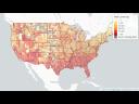
We originally were thinking about data applied to Georgia as the state and at that same kind of time this mapping project was taking off. We launched a state-level thing in May without the visualization and it's really the visualization that we worked so hard on with Clio and Solha that when that was released in that day it was very clear. I had some expectation it would spread but this was it went much faster. That's in part because it started to spread on Facebook and Twitter and Instagram and started to go through social media sites. And that really was this kind of stepping stone into this project where we then applied that concept to other countries in Europe.
This particular metric I think is something that people can really get grips on and understand a lot more easily than some of the other ones like cases per 100,000 people. I mean I don't even know a bigger group 100,000 people how much space they would take up but it's very hard to visualize and think about. To communicate risk at a personal level right that people get what it means to be at a restaurant with 50 people. They're not sure what to always do with a positivity rate or case rates that are cumulative because that's not necessarily the relevant risk at that moment.
To communicate risk at a personal level right that people get what it means to be at a restaurant with 50 people. They're not sure what to always do with a positivity rate or case rates that are cumulative because that's not necessarily the relevant risk at that moment.
Making sure that as developers you have a question in mind and I think that requires taking a bit of an empathetic perspective with respect to your potential users. It wasn't meant to be complicated it was meant to be accessible and trying to take simple quantitative principles in the midst of pandemic and letting them be utilized in this really this kind of public accessible format.
